Budca®
Re-Brand, Packaging
2020
Services
Rebranding
Concept
Packaging
Market
Wellness
Health
London based CBD start-up Budca approached us in 2019 for a brand overhaul. Branching off from classical CBD products, such as oils or capsules, the company expanded into mens grooming and skincare products.
We slightly modernized the existing logo, developed a new and simple toolkit of colors and fonts and guided the client through a re-conceptualization phase for the packging/industrial design of their product range. Moving away from cannabis related clichés we were able to shift the brand into the minimalist, high-end cosmetics space.


Moods
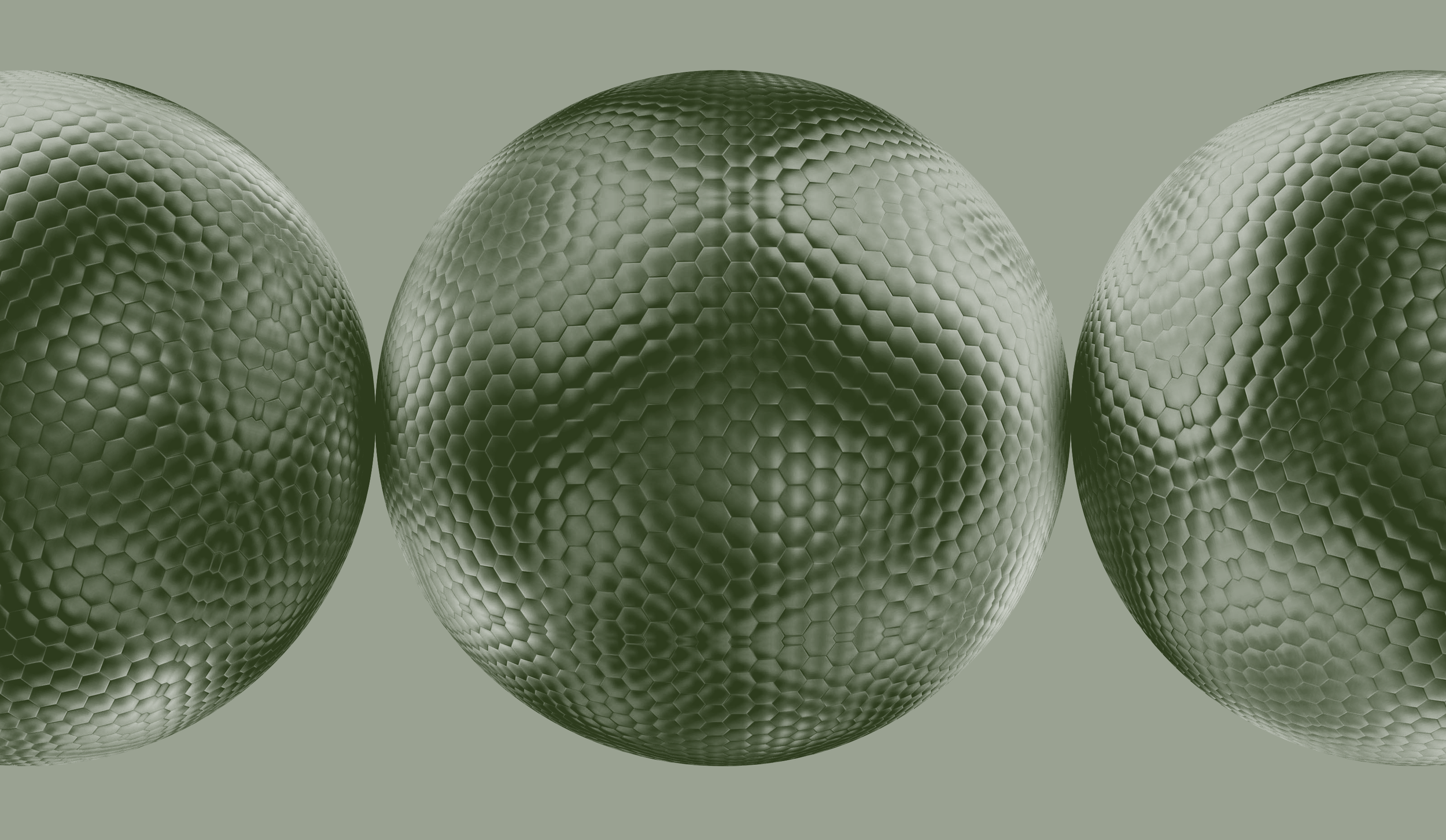
Organic, minimalist and abstract with a nod to science

The Visual Identity
Using the pre-existing visual mark as our driving element, we made word-mark and product names interchangeable, and added a single strongly muted, yet organic, color, resulting in a minimalist design system.


Imagery
Textures meet clarity


Packaging
We proposed a radical departure from the look and shape of the vessels usually used in the market — using recycled plastic we were able to completely omit the need for any outer packaging

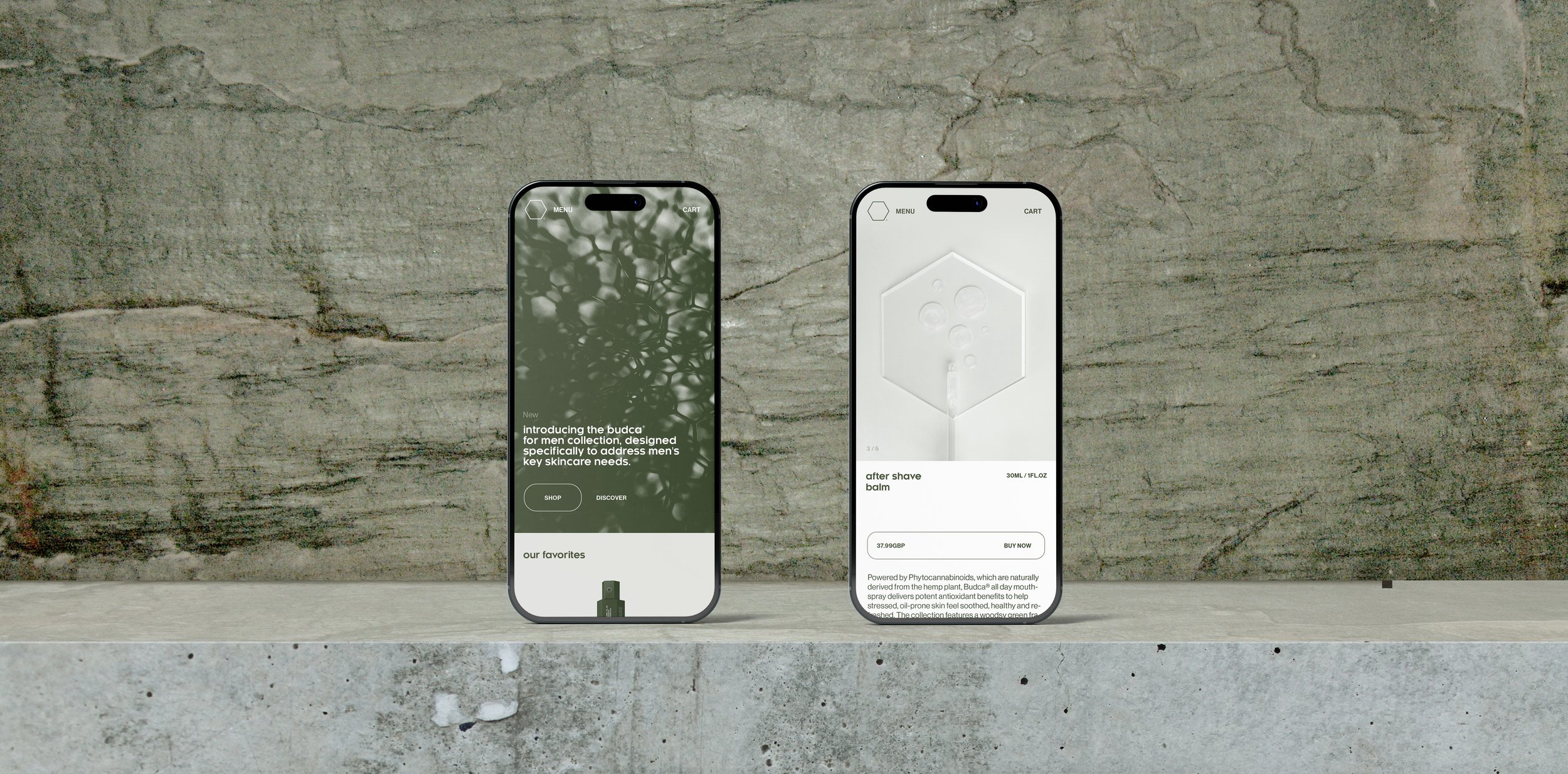
Website
Combining a science-forward look with sleek and abstract photography and a minimalist interface we elevated the brand into the affordable luxury market.