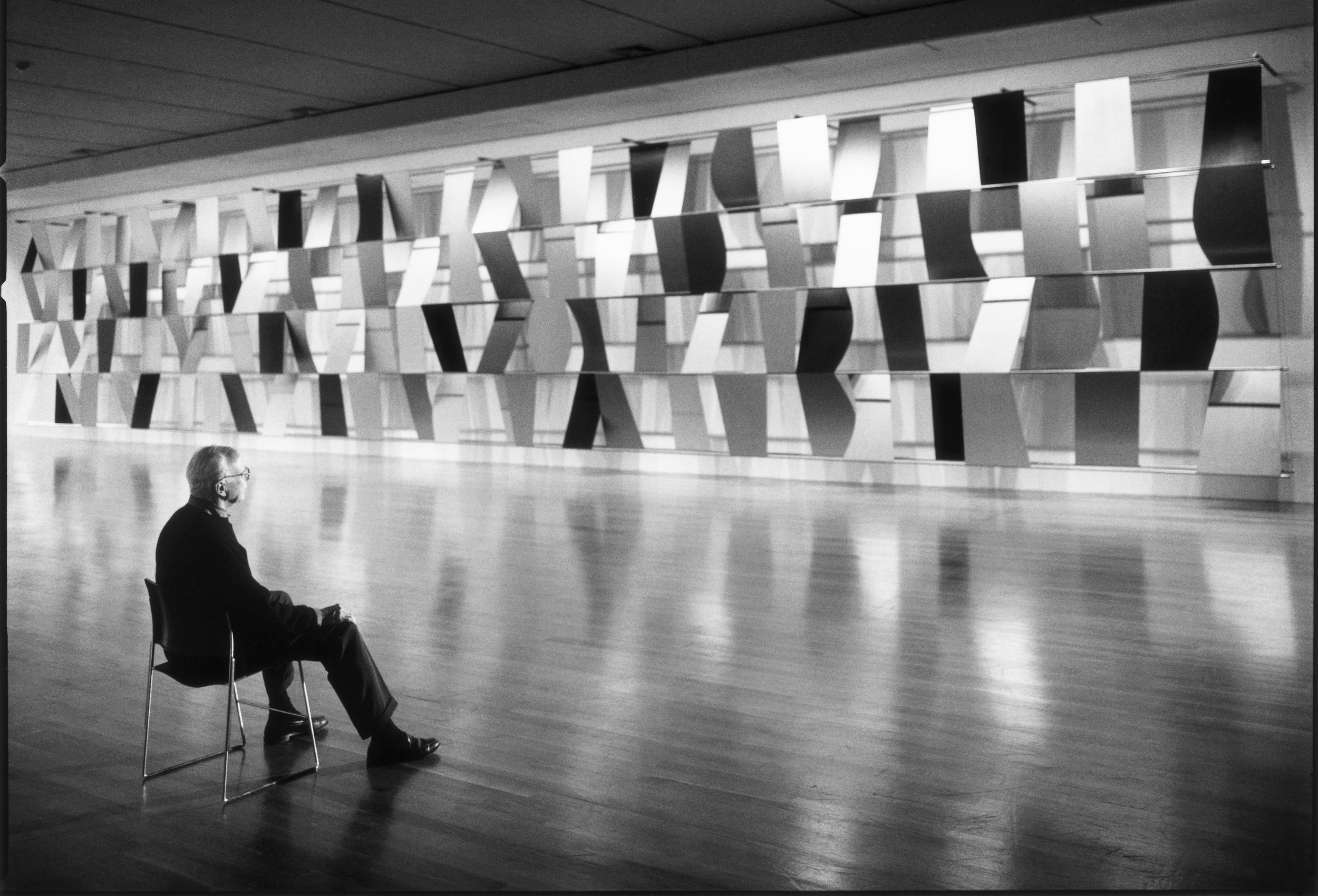
Ellsworth Kelly
Digital Experience
2023
Services
Branding
Webdesign
UI/UX
Strategy
Market
Fine Art
Culture
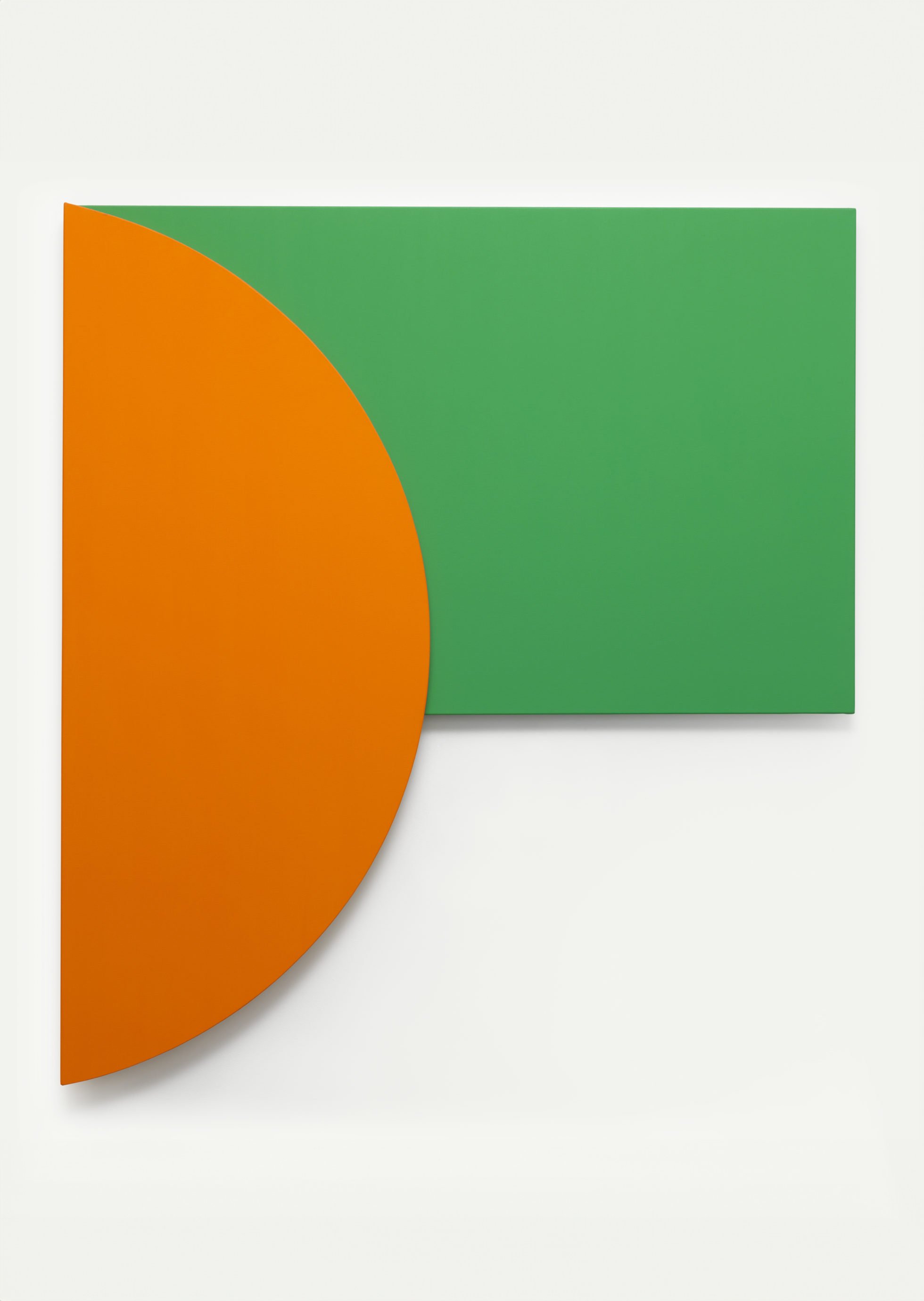
We were excited to be entrusted with the task of commemorating the 100th anniversary of the iconic artist, Ellsworth Kelly. We embarked on a journey to create a digital experience that would honor Kelly's remarkable legacy. With meticulous attention to detail, we blended vibrant colors, clean lines, and abstract shapes to mirror the essence of his artistic style.
We brought his art to life, allowing viewers to zoom in, rotate, and examine each brushstroke up close. We also included curated audio and video content, providing insightful commentary and glimpses into Kelly's creative process.

Landing Page
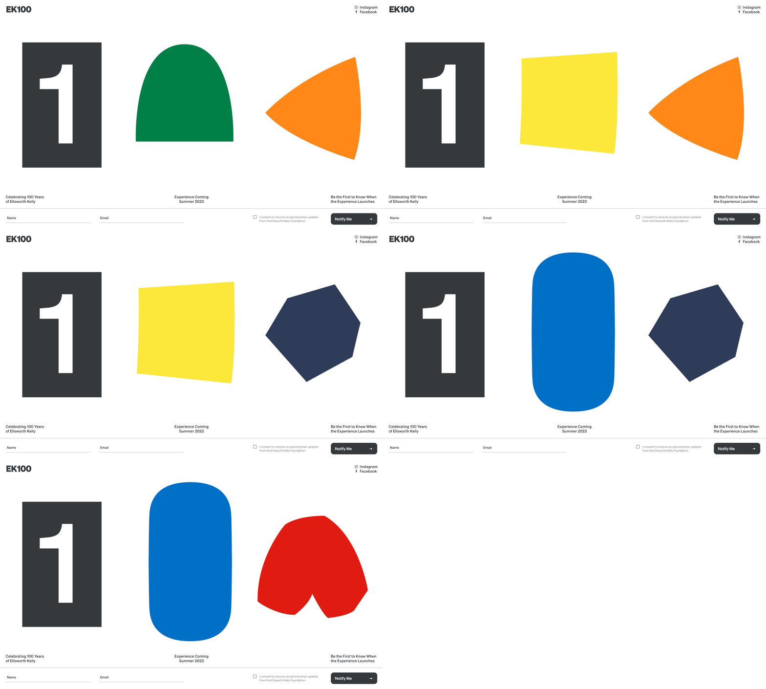
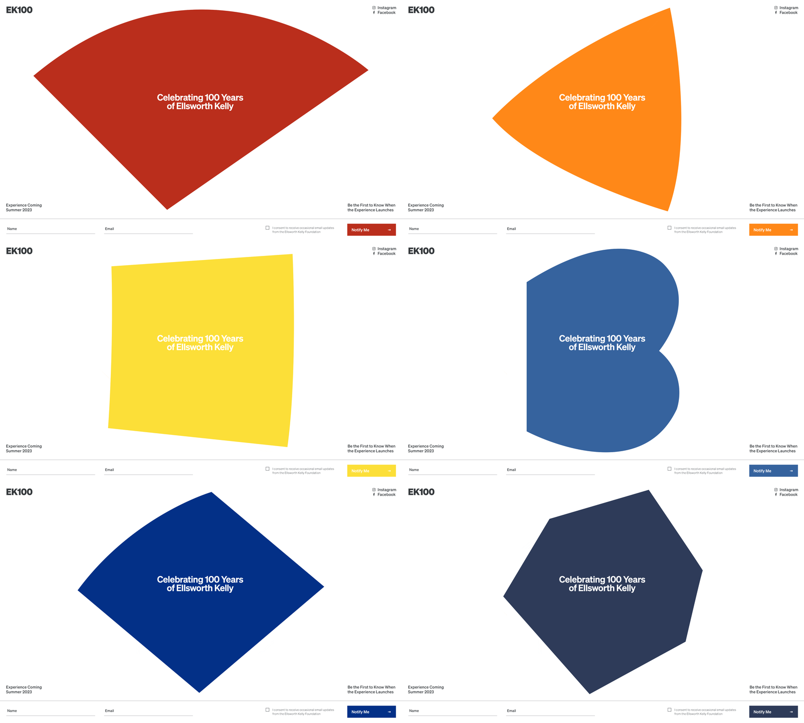
We chose to incorporate Ellsworth Kelly's iconic colorful shapes into our website design, making it a truly impactful landing page. With their bold and vibrant forms, Kelly's shapes not only catch the eye but evoke emotions and spark curiosity.
Typography
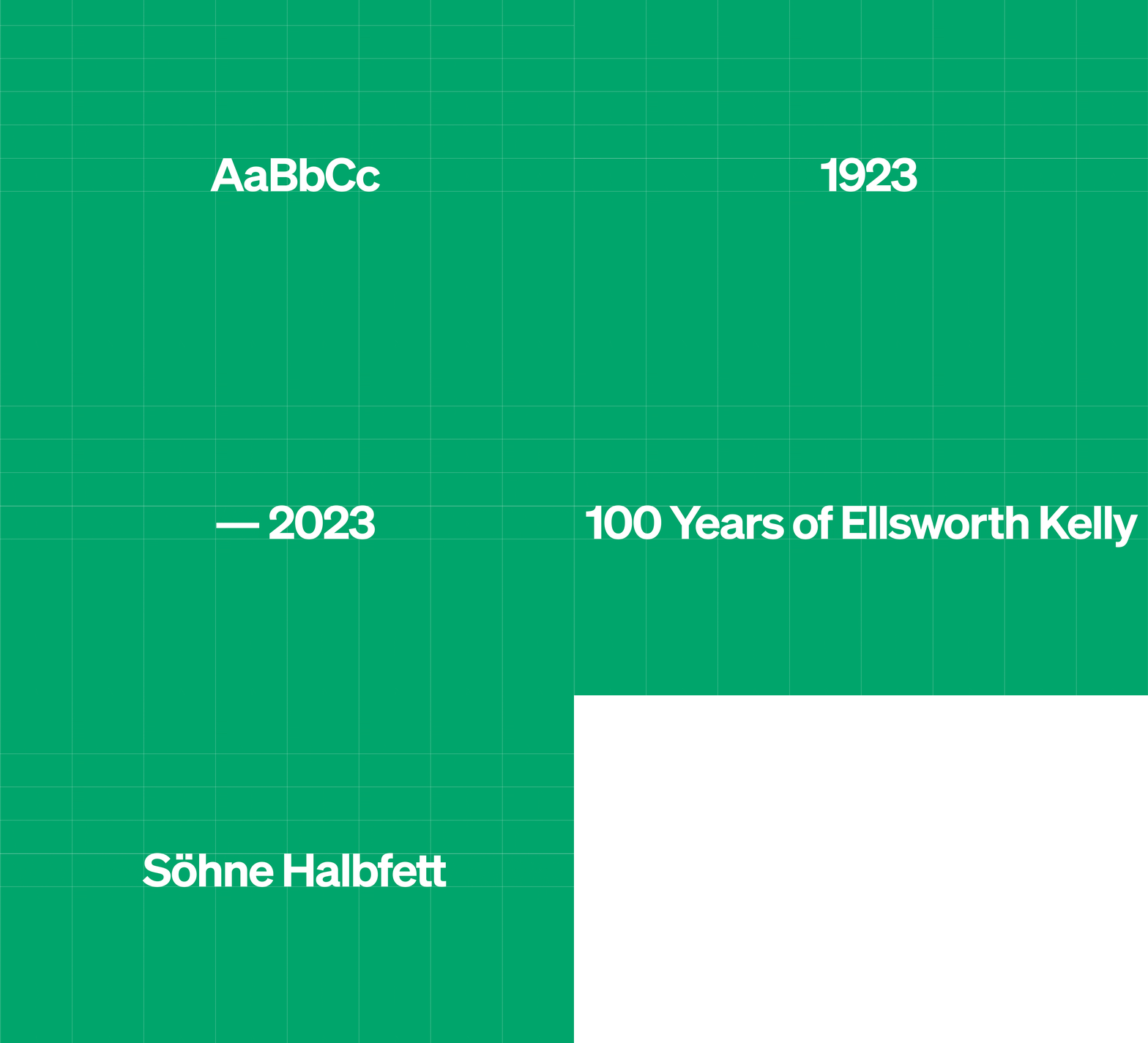
We choose to work exclusively with a single sans serif family named “Söhne” that we picked for its impactful clarity and Bauhaus feel.
Color Palette
Just like the artist himself, our palette is designed to inspire creativity, encourage exploration, and celebrate the power of simplicity in design.
Concept & Execution
Creating the visual language for this experience posed several challenges. Kelly's art is renowned for its simplicity and minimalistic approach. Translating the essence of his work into a digital experience was a daunting task. It required striking a balance between showcasing the intricate details of his pieces while maintaining the sleek and clean design that reflects his artistic style.
Our aim was to create a digital experience that captures the essence of Ellsworth as a person, not just as an artist. We understood the importance of ensuring that our design and art direction played a supporting role, rather than overpowering Kelly's captivating storytelling and artistic brilliance. With this in mind, we utilized a more restrained approach that allowed Kelly's story and art to take center stage.


Playful Purism
Simplicity, empty space and assymetry were the guiding design principles that inspired us and that we borrowed from Ellsworth Kelly’s work.


Landing Page
We chose to incorporate Ellsworth Kelly's iconic colorful shapes into our website design, making it a truly impactful landing page. With their bold and vibrant forms, Kelly's shapes not only catch the eye but evoke emotions and spark curiosity.
The Museum
We sought to create an immersive and captivating digital experience for our users, so we deliberately designed it to resemble a museum.

Ellsworth Kelly
1923 — 2015

